Published May 20th 2015
How To Massively Boost Your Blog Traffic With These 5 Awesome Image Stats

I’m always giddy when I come across new data, aren’t you?
So when BuzzSumo came to Canva with all this juicy information about how images impact social shares, I couldn’t wait to get into it.
And, well, it didn’t disappoint.
What you’re going to learn today is going to change how you look at images, and the way you share content for the future. Not only is the data going to blow your mind, but you’re going to have lots of expert tips on how to make the most of your images too.
You’re going to learn:
- Stat #1: Understand Image To Word Ratios To Get More Traffic: The perfect word to image ratio for maximum shares
- Stat #2: Add Images To Facebook Posts For 2.3x More Engagement: How to get 2.3 times more engagement on your next Facebook post
- Stat #3: Use Large Summary Cards For Over 3x More Twitter Interactions: A simple twitter card change for 300% more engagement
- Stat #4: Go Beyond Featured Images To Double Your Pinterest Traffic: How we managed to get 100% more Pinterest traffic (by accident) in 60 days
- Stat #5: Create Picture List Posts For The Traffic/Share Sweet Spot: The new style of post that is going to boost traffic and shares on your site
- Putting The Data Into Action…
I’d bookmark this one, because you’re going to want to keep this to hand. But, until then, let’s get stuck into the data shall we?
Stat #1: Understand Image To Word Ratios To Get More Traffic
It’s no secret that using more images in your blog posts can deliver a big spike in traffic and shares. But, nobody has ever quite understood just quite how many images you needed to get those benefits.
As it turns out, it doesn’t matter how many images you use. You just have to find the sweet spot between words typed, and images used.
Let me explain:
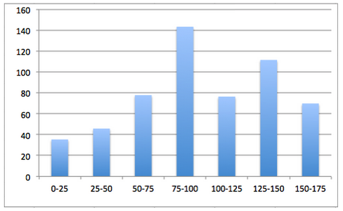
In a study of over one million articles, BuzzSumo looked at how many blog posts with images were shared. Then they looked at how many images, per how many words, got the best results.
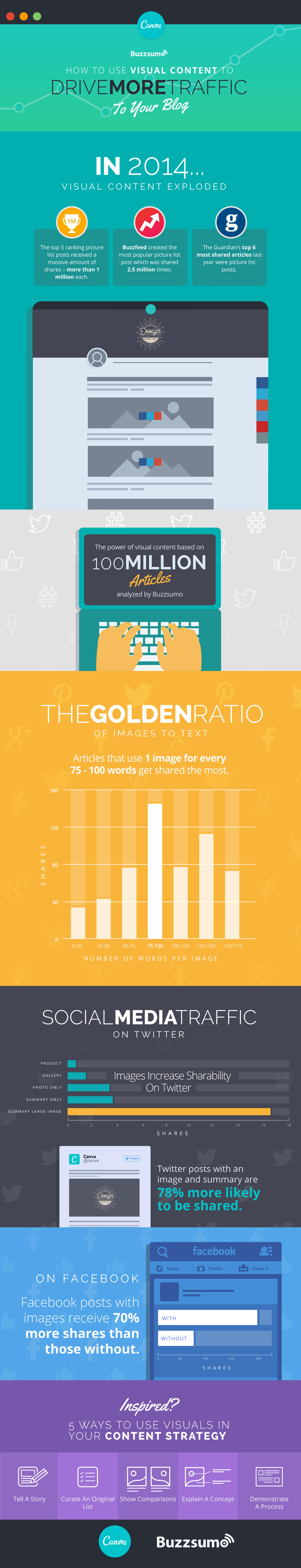
What they found was articles with an image once every 75-100 words got double the amount of shares of articles with fewer images, and a minimum of 30 more shares than articles with more:
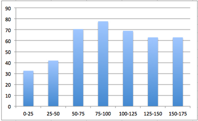
But, if this is across the board, how does this break down to the two main social media sites – Facebook and Twitter? Well, those platforms showed that the posts with the same image to word ratio got the most shares, too. Facebook had between 45 and seven more shares:
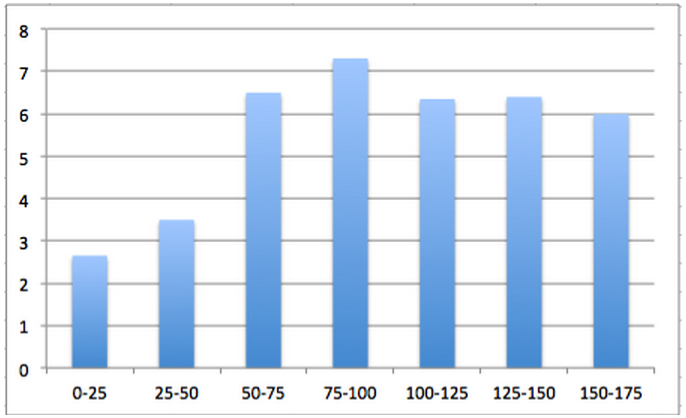
And on Twitter the ratio still managed to maintain a one share lead (on average) over all other ratios:
Find Your Best Performing Content
What does this mean for you when you’re creating content then? It doesn’t mean you have to purposefully jam an image into your content every 75-100 words, even if it the image isn’t relevant to your topic. The data isn’t quite that literal.
Instead, you should treat it more like you would the readability scale for your blog post. You know your sentences should be under around 20 words, but not every sentence is. The longer ones are made up for by the shorter, snappier sentences in other places.
When it comes to the end of your post, try this:
- Look at your Word Count
- Count how many Images you’ve used
- Add or remove relevant (yes, relevancy is really important) to make it fit in that ratio
It doesn’t matter if you’re closer to 75 or if you’re knocking on the door of 100, as long as you can sit between the two.
Stat #2: Add Images To Facebook Posts For 2.3x More Engagement
We’ve known for a while now that adding images to your Twitter updates can generate 150% more Retweets than your usual plain-text updates. But, the jury has always been out on how images impact engagement (likes, comments and shares) on Facebook.
But, this latest data shows some staggering results. From looking at over 100 million Facebook updates over the last three months, BuzzSumo found that updates with images had an amazing 2.3x more engagement than those without:
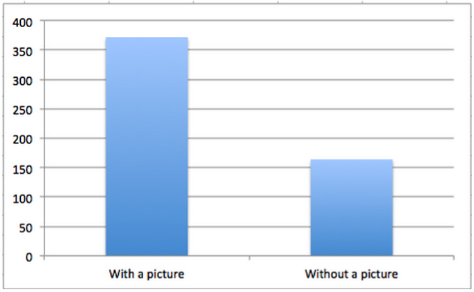
To put that into perspective, that means for every one like you get on a status update without an image, you could have had at least two more by adding an image.
Which, now you know it, is a no brainer. But it does leave one pressing question:
“What makes a good Facebook image?”
Aha! That’s where having someone from Canva writing this post comes in handy, because I know how to answer that one.
The short answer is:
It has to be relevant.
While there are undoubtedly benefits to using any image over not using an image at all, it’s important that your images make sense to the topic you’re writing or sharing about. But there’s no silver bullet for the type of image you use.
Mary from the Canva Designs School recently discussed five types of image you can use to drive engagement on Facebook:
-
Photos:
Photo’s make up a lot of what we interact with in our daily lives; the same goes for social media. Relevant snaps – like Product shots – are relevant, and can catch your reader’s attention.
-
Charts:
Like the images you’ve already seen in this article. Data Driven charts can cause an incredible discussion between your readers.
-
Visual Representations:
The majority of the world’s population are visual learners, and giving them this easy-to-digest imagery will not engage them, but add incredible value.
-
Comics:
These are quirky, bright and usually quite funny. They can add a little bit of light-heartedness into dreary Monday morning news feeds. Be selective with this, though. It really needs to fit your brand.
-
Annotated Screenshots:
Screen-grabs of your latest project or case study – or just pointing out a crazy YouTube comment – can be a great way to get your readers talking, and intrigue people into your latest post.
Before you choose any one of these image types though, you need to ask yourself a few questions:
- Does this image improve what I’m about to say?
- Is it easy to understand?
- Are there any images that could be better suited?
- How will my audience react?
If you’re in doubt about any of these questions, head back to the drawing board and choose/create something new. But if you have all positive answers, you’ve got a great piece of visual content that will boost engagement.
All that’s left to do now is post it.
Stat #3: Use Large Summary Cards For Over 3x More Twitter Interactions
Okay, so I know exactly what the first thing that came to your mind as you read that:
“What the heck is a Large Summary Card?”
But that’s okay. You might not know it by name, but you’ll definitely know it when you see it. Here’s one in action to jog your memory:

This wonderful little piece of a Twitter code is about to become the new way you share your content. Because this is the most highly engaged type of tweet you can create. In fact, it has 300% more shares than any other.
After looking at 10 million Tweets, the data showed that this large card had an average of 16.2 shares, while the next closest was a normal summary card at only 3.7 shares:
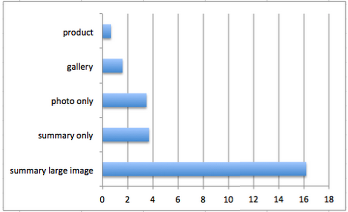
That’s a little bit of a difference, right?
But if you were to head over to twitter to try and create one of these cards, you’d struggle, because there isn’t an option to do it. Instead, the card has to be coded into the piece of content you’re sharing.
Don’t worry, though. It’s not as hard as it sounds – trust me, me and my dog have the same knowledge of coding – because twitter have made it super easy. Just follow this process:
- Open the content you want to add the card too
- In a new tab, open this link from the Twitter development team
- Go to the ‘text’ area on the WordPress page
- Copy and paste the code to the bottom of the post
- Edit it to fit your content
- Save and Publish
Now when you share the link, this large summary card will take the place of your original tweet. All you need now is a coffee to enjoy whilst you watch the engagements pour in.
Stat #4: Go Beyond Featured Images To Double Your Pinterest Traffic
Before we knew about the sweet spot you just read about, we conducted some of our own research into how images could increase traffic to your blog.
And, being Canva, we thought we understood just how images worked online. But if we’re brutally honest, we didn’t. At least not until we conducted our research and looked at all of our competitors – and some of the biggest blogs around the internet.
What we found was surprising.
People weren’t just adding a nice looking featured image (read: blog banner) like we were; they were actually adding a lot of relevant images into their posts. And they were getting more traffic than us because of it.
So we made a change. As part of our editorial policy, we made an agreement to consistently add relevant images throughout our posts. We experimented with picture list posts, featuring other designer’s work, creating our own unique content and more.
The results? Well, take a look at our traffic through Pinterest for the 60 days before we made the change (orange) and the 60 days after we made the change (blue):
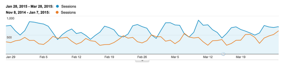
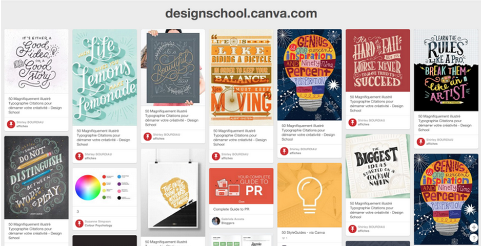
By making that small change, our Pinterest traffic jumped 62.5%. Don’t get me wrong, featured images do add value to your post, but look what happens when you search for the Design School on Pinterest. There are very few banner images, and lots of juicy images from within our posts.
Well, if there’s one lesson to be learned from here, it’s this:
You need to treat your images as content.
They aren’t there for decoration. They aren’t there to break up the post. And they aren’t there just because it’s better to have them. Your audience won’t share them just because they’re in front of them.
You need to create (or choose) images that add value to your readers, or are worth them sharing to their own audience. For example, Quote images are the most shared, but they don’t particularly add value. Yet, they always make sense to be shared to an audience.
And – as you’ve picked up on already in this article – your images need to be relevant to what you’re talking about, and not just thrown in at random.
Stat #5: Create Picture List Posts For The Traffic/Share Sweet Spot
If you’ve been reading blogs for longer than, say…one day, you’ve probably picked up on the fact list posts generate a lot of traffic. And, as you’ve learned so far in this article, images are a powerful traffic-building tool.
What’s my point?
Well, if both of these elements create so much traffic, why don’t we put them together and create a super-post that generates a ton of the stuff. A little like what The Travelling Wilbury’s did for music.
Now this isn’t just me saying, “Hey, that sounds like a good idea, let’s write about it!” either. In fact, this style post has a firm grounding in science.
Let’s look at some of the facts:
- The brain processes images 60,000 times faster than any other information
- 90% of the information transmitted to the brain is visual
- 40% of people respond better to visual information than text
A great example of this style of post is the site, Cracked. They only use list posts to drive over 2 millions readers to their site in a month. But, they also are huge proponents of picture list posts.
Their article, 15 Things Americans Secretly Suspect About Other Countries, it contains less than 200 words of text, and is made up only of funny pictures like this:
But in just three days this post managed to pick up a lot of social shares and views:

You’d be quite happy with 2100 shares in such a small space of time, right? Well image lists could be the way for you to do it.
This doesn’t just have to be your standard list post format either. The Guardian newspaper compared D-Day landing sites between 1944 and now and managed to gather 324,ooo shares from it:.
There’s also scope to take these posts into:
-
Stories
Tell a story through pictures of what’s going on. This can work for all niches, and is easy to make an emotional connection with your readers.
-
Tutorials
Combine a list, how-to and image post together and create a visual guide about how to achieve something in your niche.
-
Inspiration
Create a list of quotes, design ideas or thought-provoking images.
The only real boundary to this type of post is your imagination. If you can think of a list post, I can guarantee there is a way to turn it into an image list. And you can reach a whole new segment of your audience because of it.
Putting The Data Into Action...
Let’s do a quick recap of what this new data tells us:
- You should aim to use a relevant image every 75-100 words in your content for the most shares
- All of your Facebook posts should contain an image
- Large Summary Cards are the most effective way to share content on Twitter
- The more relevant images in your posts, the better your Pinterest traffic
- If you want to drive traffic and shares, picture list posts should become part of your strategyNow the way I see it is that you have two options here. You can either look at this post and say, “Hey, that was good!” and never actually use any of the information you’ve learned.
Or, you can choose at least one of the strategies you’ve learned and apply it to your next blog post or update.
Inspired? Share the infographic below to spread the word to your fellow content marketers. We’d love to hear your thoughts in the comments below!
Learn More at a Webinar
Join Canva & BuzzSumo at one of the times below to find out what the latest data reveals about images and social sharing!
Andrianes Pinantoan heads growth marketing at Canva. We are launching Canva For Work, a tool that will allow you and your team easily design stunning visuals. Register here to win free accounts.
Categories
Content MarketingCategories
Content MarketingThe Monthly Buzz⚡
Subscribe to BuzzSumo's monthly newsletter to:
Stay up-to-date with the best of the best in content marketing 📝
Get data-informed content, tips and tidbits insights first 👩🏻💻
Read top shared content by top marketing geeks 🤓
Try
Enter any topic, term or url to search to see BuzzSumo in action. It’s free!
100% free. No credit card required.