Delivering a data analysis that both motivates and enables marketers to take action is where the rubber meets the road in analytics.
It’s where analysts deliver marketing analytics value to our teams, clients or executives. It’s where we help them make informed marketing decisions that can lead to exponential growth. It’s a data-centered hero’s journey.
Let’s consider two different analysts. Rupert and Anna-Lisa.
Rupert's team wants to know how a campaign or website performed.
To provide that data, Rupert must put long hours into measurement setup. Then, when asked, he’ll pull numbers, translate them into charts, and eventually send his lengthy report.
Throughout the process, he’s married to his laptop, putting long hours into busting out charts while skipping family dinners, an entire season of Game of Thrones, and once, a ski vacation.
Despite all that sweat and tears, Rupert's team members aren’t his biggest fans. His answers to their questions, despite his Excel wizardry, fail to inspire action. At best they take a look at one or two numbers. At worst, they’re annoyed with Rupert for sending so much stuff to process.
If only Rupert knew to read this article, he would realize that what marketers could really use are analyses tailored to drive action — not overwhelming reports.
So, you may be asking, what is the difference between a poor (though thorough) report and a great analysis?
A dead-end report doesn’t lead to or highlight recommended action. It describes what already happened, without adding value with suggestions about what will happen next.
A great analysis, on the contrary, avoids data puke and creates a file with a human touch that helps the viewer act on the data presented. It enables growth and improvement via informed action.
Consider Anna-Lisa. She knows that acting on data is how marketers get their analytics money’s worth. When she’s asked a question, she thinks about how her answer could help her team to make a decision.
Then, she uses automated reports to get a head start on creating analyses that convey her unique way of seeing the numbers. Per Aaron Mass’ tip on critical questions analysts need to ask, she tries to answer the progression of:
- What’s going on?
- Why is it going on?
- What can we do about it?
- What can we expect?
Anna-Lisa adds heaps of value to her teams, and they respect her highly for it.
To let you get her level of pay (along with vacation time only common in Nordic countries) here are three main things you can do to make bland reports into actionable analyses.
1. Pack in Your Analyst Brain
Goal – help your team see what you see and think how you think.
Explicitly state the questions to ask of the data
Choose one main question you’re going to answer for the team, e.g. the way David Krevitt does when building the agency data pipeline.
Then imply the question in the title of your file. Next, elaborate on the question, and restate it specifically at the top of the charts. Emphasizing the question will focus the reader’s intention and get their minds to play detective.
Add conclusions and highlights
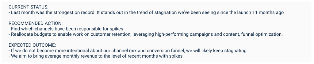
At the bottom of your chart section, state your findings, grounded in the data shown. This will often be the element the viewer pays most attention to. Follow Avinash’s steps for avoiding crappy dashboards:
- Interpret current state – what is going on and why you think it is going on
- Recommended action – what the team can do about it
- Expected outcome – extra motivation to go take the recommended action
2. Use Context and Comparison to Help Readers Understand Data
Goal – create a benchmark that gives perspective.
Here, Rupert would tell you that Vincent is six feet tall and leave it at that. Anna-Lisa would tell you that Vincent is six feet tall, but she’d also show you that average height in Vincent’s country of the Netherlands is 6’1”.
Context helps you avoid wrong conclusions, such as that Vincent must have been on his high school’s volleyball team.
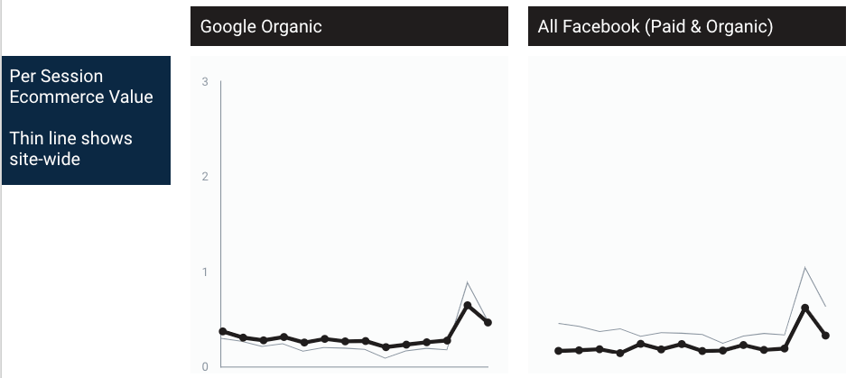
In a similar fashion, some questions, like those about budget allocation, require comparison and can only be answered after considering the context of all channels.
For example, Anna-Lisa might compare site-wide performance over time, or juxtapose a channel’s trend to a site-wide trend. Moz has published an elaborate illustration in this SEO channel context analysis.
If you have your own favorite ways to illustrate comparisons or add context, let us know what they are in the comments below.
3. Lead the Viewer’s Eye to Conclusions From the Data
Goal – Help the team follow your storyline.
You know you’re being a Rupert if your team has read your file and they’re still asking you questions such as “What do you suggest? or ”Why do you say that?”
Fortunately, it is easy to be as loved by all as Anna-Lisa.
She always aims to make her reasoning clear by using subtle visual clues that allow her to minimize the amount of text. To follow suit, use the following data visualization hacks.
Size & Distance
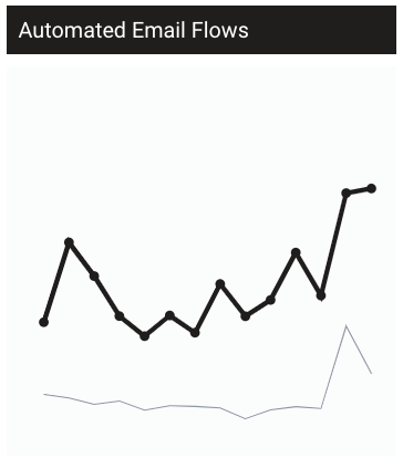
The main concept to follow is to add strong visual clues where you’d otherwise use numbers only. To apply this, you can enrich a dull table with bars. Alternatively, add a line to your time series that compares to a site-wide benchmark. Then, when you’re showing multiple scores, enrich each with bars.
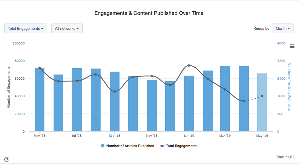
BuzzSumo’s trend line in their exportable content analysis charts quickly put engagement numbers in perspective.
Color
To leverage color, highlight a time series to make a chart stand out in a grid. Or enrich your table with a heatmap that uses shades of one color (multi-color heat maps get hard to interpret).
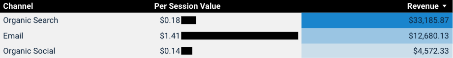
Order
First, show a row with channel comparison of per session value. This will show which channel has the most valuable clicks. But to really know whether the channel is worth a budget increase, you need to consider the volume of its potential. So as a second element, include a row with channel comparison of volume.
This will help you validate the opportunity and show where new revenue can come from – without compromising revenue sources that are already established.
Look at the order of the whole Data Studio embed below to get inspired by its intention. We like to follow the order of:
- Start broad to introduce what’s going on
- Narrow down to break down why it’s going on and point out action items
- Add insight to validate your recommendation for what to do about it. This makes it easier to estimate the outcome.
Bringing It All Together
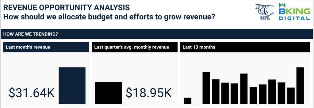
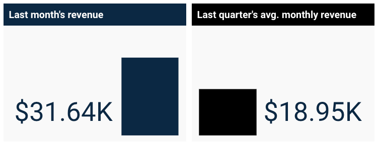
Trying to be more like Anna-Lisa, we’ve put together the following analysis in revenue opportunity analysis template in Data Studio.
Feel free to copy it and use as a template. All you’ll need to do is to add your own data source based on a Google Analytics property that collects ecommerce data.
Conclusion
Our process is to first create visualizations for our own analysis. In this step, you get creative, make an analysis loaded with charts while it’s for your eyes only. You explore. Then you trim it down big time, so you only keep elements that directly contribute to answering the main question. Any ancillary questions have to support the main question and its answer. Once you trim it down, you get a file like the one referenced here. For example, the report above was originally part of a larger file. Analysts must find a balance between making their analysis quick to digest and backed by enough data. The rule of thumb is: “Can I do without this chart in order to answer the question and inform action?” Encourage action by making it as simple as possible, but not simpler (that is not a Spiderman quote, it’s by Albert Einstein indeed). Some of the linked charts were first created when creating reporting solutions for MashMetrics. For more inspiration and best practice, check out data viz makeovers by Evergreen Data, Primp Your Slide by Lea Pica, Google Data Studio Gallery, and bkingdigital.com/#how.
Branko Kral is going to analyze data on how you engaged with this article and use that insight for his future content. He’s a director of analytics, after all. He is also a linguist from Slovakia with an international background, entrepreneurial spirit and passion for community building. Based in the highly delightful Mammoth Lakes, CA, he helps develop remote professionals.
Categories
Competitive AnalysisCategories
Competitive AnalysisThe Monthly Buzz⚡
Subscribe to BuzzSumo's monthly newsletter to:
Stay up-to-date with the best of the best in content marketing 📝
Get data-informed content, tips and tidbits insights first 👩🏻💻
Read top shared content by top marketing geeks 🤓
Try
Enter any topic, term or url to search to see BuzzSumo in action. It’s free!
100% free. No credit card required.