Published September 19th 2016
How To Create Engaging Data-Driven Stories: 5 Tips & Ideas
“Data-driven storytelling is poised to be the next big trend in content marketing.” Harvard Business Review, October 2015.
“Data-enhanced storytelling is rapidly reshaping both content and advertising.” Adweek, January, 2016.
There is a growing interest in data driven stories. A new breed of journalists are uncovering and telling data-driven stories facilitated by access to large datasets and easy to use data analysis tools. Content marketers and SEO teams are also drawn to data-driven stories by evidence that research and data based articles attract more links.
In this post below we explore the five core narratives for telling stories with data, namely:
- Trends. For example, how smartphone ownership is increasing or decreasing.
- Rank order or league tables. For example, the politicians getting the most social media coverage or which areas have the highest crime rates.
- Comparisons. For example, how one company is performing relative to another.
- Surprising or counterintuitive data. Data that challenges or confirms something that people believe to be true, or data that is simply surprising.
- Relationships. For example, correlations, potentially through to causation and prediction.
Here’s how we’ll be breaking this down:
What are data driven stories?
Wikipedia defines data driven journalism as “analyzing and filtering large data sets for the purpose of creating a news story.” The process is one of uncovering insights from the analysis of large data sets to reveal stories that may be hidden in data. In this way data driven journalism allows journalists to reveal untold stories or find new angles on stories.
Data driven journalism typically follows a process of finding data, filtering data, analysis and visualisation, and finally telling the story. Visualisations in the form of charts and images is often a core part of the story telling. The Financial Times for example, currently runs a column called ‘Chart that tells a story‘ – the premise being that they find a single chart which tells a story.
Five Core Data-Driven Narratives
1. Trends
Trends, rising or falling, form the core narrative of many data-driven stories trends. A good example of a site that uses trend data to tell stories is the Financial Times. Here are two recent trends it has highlighted to tell stories about low global interest rates and the burden of an ageing population.
On interest rates the long term trends on bond yields are not encouraging for those that want to see higher rates. The chart tells a story about a long term shift over 30 years and how rates continue to fall as central banks try to grow the economy. The interesting question is what happens when interest rates hit zero. In Germany, Japan and Switzerland we now have negative interest rates.

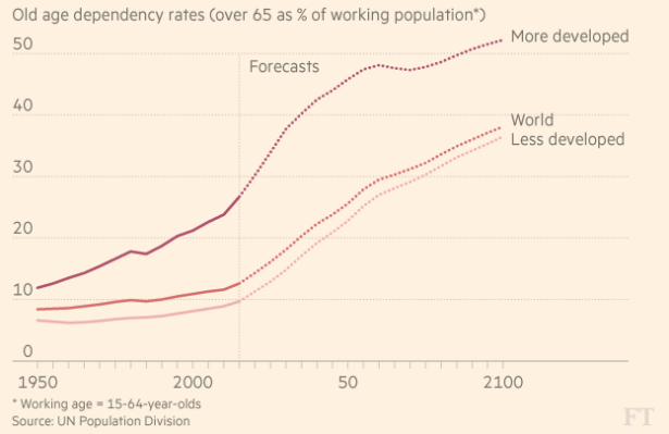
We have probably all know that the population is ageing. The FT chart below tells a story about the potential economic impact of these changes by showing the number of people over the age of 65 as a percentage of the working population.
Typically trend stories focus on how something is rising or falling over time. However, even a flattening trend can be a major story. One story has been how Twitter is failing to grow its active users. This story can be told through very clearly through the chart and headline below.
“Twitter Fails To Grow Active Users”

(Active users in millions)
Once you see a trend the obvious next question is why, why is it increasing or falling, or in Twitter’s case flattening. Thus the trend is not the whole story, it prompts further areas for investigation.
2. Comparisons
A common data-driven narrative is comparisons. For example, we can take a different angle on Twitter’s failure to grow its active users by comparing how it is performing relative to Facebook. This has been a story angle taken by a number of publications. Below is an example chart used to show how Facebook is outperforming Twitter.
“Active Users: Facebook Continues to Outperform Twitter”
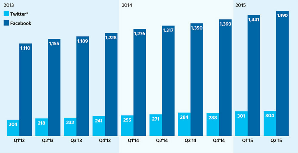
(Active users millions)
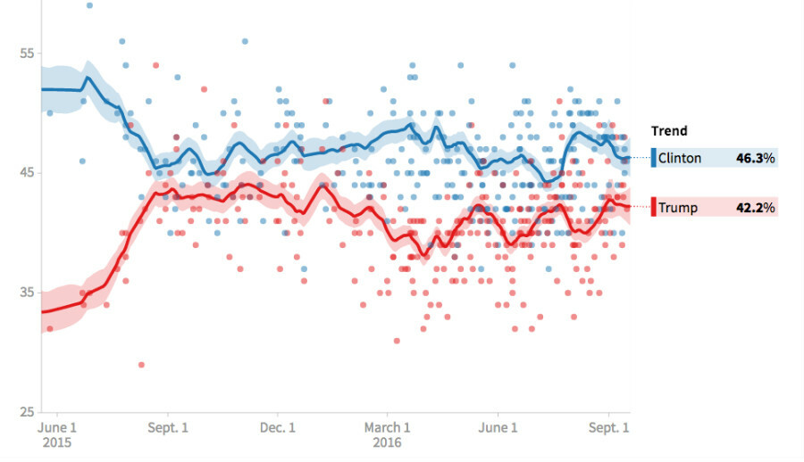
Comparisons and trends are used in extensively in telling political stories. For example, this image from the Huffington Post shows the the story of the current US political presidential campaign using opinion poll data.
3. Rank order or league tables
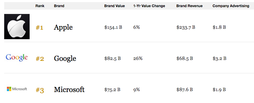
Rank order or league tables are another common narrative suited to data. Here is an example from Forbes of the world’s most valuable brands.
We have provided some content marketing examples below from our own BuzzSumo data.
This first table below shows the sites with the most shares of articles about content marketing in the 12 months to February 2016.
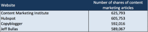
We could write a story on the top content marketing sites by using the data in this table.
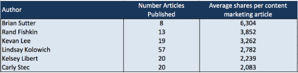
This second table shows the authors with the highest average shares of articles on content marketing. Brian Sutter‘s articles on Forbes have helped make him the author with the highest average shares. All credit though to Lindsay Kolowich for a really consistent level of shares for her content marketing articles on Hubspot.
4. Relationships
Exploring relationships between data is a complex area, particularly when you want to see if one factor has a particular impact on other factors or can predict another factor. However, with advances in machine learning it is an area where we will see a lot more data driven stories.
A simple approach to exploring relationships is to look at the correlation of two sets of data. It is important to remember that correlation is not the same as causation but it can highlight areas for further research.
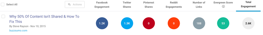
For example, we did a piece of research with Moz where we looked at the relationship between social shares and links. We took a data set of 1m posts and used the Pearson correlation co-efficient, a measure of the linear correlation between two variables. The results can range from between 1 (a total positive correlation) to 0 (where there is no correlation) to −1 (a total negative correlation). The overall correlations for our sample were effectively zero, for example the correlation between total shares and referring domain links was just 0.021.
Our research implies that people share and link to content for different reasons. The data also suggests that research and data posts achieve relatively high levels of links, which is a great reason for writing data driven stories. Our Moz article itself became an example of how data driven posts attract links, the post currently has over 188 referring domain links as we can see below.
One of the most famous examples of exploring data relationships was highlighted in the film Moneyball. In exploring baseball data it was found that some surprising factors were strongly correlated with a team’s win percentage. One of these was OPS (on-base plus slugging). This adds together a player’s on-base percentage, the percentage of time a player gets on base and the average number of bases a player reaches when they come to the plate (slugging). The data found a very strong correlation between the OPS and the win percentage as we can see below.
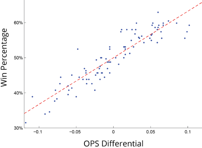
The OPS was the factor most strongly correlated with winning, more so than home run totals and batting averages. Hence, teams started looking for players with the highest OPS scores.
You can also explore relationships in more depth by building predictive linear regression models. I particularly like the models that predict the quality of wine by using factors such as average summer temperatures and rainfall levels.
There are an increasing range of tools which will allow you to apply advanced techniques such as machine learning. Machine learning uses algorithms that can learn from data and make predictions. In essence you build a model from example data inputs that enable the algorithms to make data-driven predictions. This is a growing field where we will see a lot more activity. Machine learning is something we are exploring and looking to apply at BuzzSumo.
If you can uncover surprising relationships, you can then start to make steps into predictions based on the data. That can create a whole other set of fascinating posts. The work of Nate Silver in predicting sports and election results at fivethirtyeight.com makes for compelling reading. It’s the result of his deep analysis of a huge array of available data on election results.
5. Surprising or counter intuitive data
Some of the best stories from data research emerge when the data reveals something that is surprising or even counter-intuitive. I personally liked the research which found that 5 glasses of champagne a day can help prevent Alzheimer’s disease.
For this article I decided to look for surprising data about the US to use as an example. The data I personally found most surprising was on incarceration.
“America Imprisons More People Than Any Other Country”
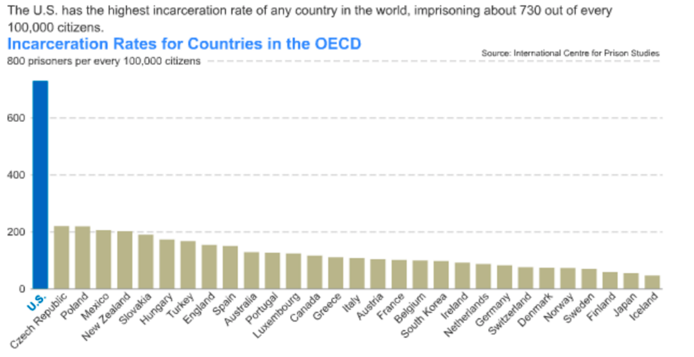
The chart above shows US incarceration rates relative to other OECD countries. However, the US also has higher incarceration rates than China or Russia and higher numbers of people incarcerated.
This data intrigued me so I did some more research and found that incarceration rates in the US were very similar to other countries until 1980, when it increased significantly. See the chart below.
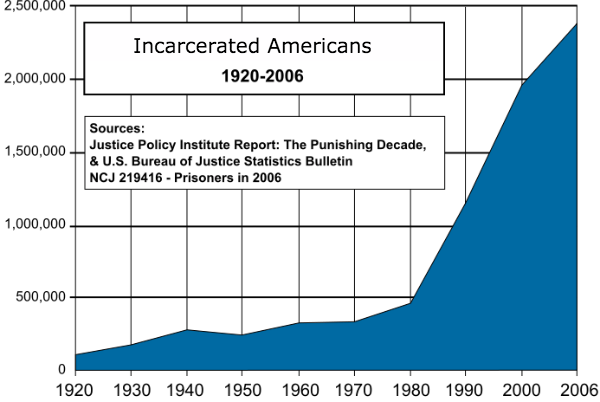
This chart begs the question why did incarceration rates increase so rapidly after 1980? You will need to do your own research but articles I have read suggest that privatisation of prisons and a different approach to incarceration for drug crimes may be responsible. This type of relationship analysis is at the core of the hugely successful Freakonomics books.
Data driven stories are hard work
There is a misconception that using data is a quick and easy way to create stories. The Guardian says that data driven stories are 80% perspiration, 10% great idea and 10% output. This resonates with our own experience.
The process involves analysing a lot of data without knowing if you will find any significant insights that tell a story. A significant amount of time is spent gathering, filtering and cleaning the data, running different forms of analysis, exploring potential implications and testing theories with further datasets. At BuzzSumo we have analyzed datasets of millions of articles looking for insights and sometimes we can spend days and weeks without discovering anything of value or a story of interest. Those are not our best weeks
The best data driven stories are original
In our view one of the great strengths of data based stories is that they can tell original stories. They can reveal trends, correlations or counter-intuitive surprises that make people look afresh at an issue. Original research does not mean you necessarily need original data. The data sets that Peter Brand had access to in the famous MoneyBall story were widely available, it was the research and analysis that was unique. These days there are thousands of datasets widely available and an increasing range of tools to help analyse the data. These include Tableau, R, Google Fusion Tables and IBM Watson.
It is clearly advantageous if you have access to an original or unique data set. At BuzzSumo our core business is crawling and collecting very large datasets but most companies also have access to unique data. For example, most businesses have data that is important to their performance and their industry. This can be sales data, market intelligence or simply an understanding of issues through data from your support desk. Data that you might consider commonplace could contain insights that are helpful to your audience.
Data-driven story telling tips
Here are some tips on writing data-driven stories based on our our experience, it would be great to get your tips and feedback.
1. Start with a story idea
If you start with an idea for a story you can then look for data which confirms your ideas or alternatively debunks the ideas. Focus on content ideas and stories that are interesting to your audience.
For us a great story might be “Why ‘how to’ posts get 50% more shares”. Of course the data may not support this headline but it gives a clear direction of the data we would need and the type of story we want to tell. There is a danger of bias in operating this way and you need to honestly reflect on whether your data supports your conclusions.
2. Check your facts
If you have made a mistake or have inaccurate data you will soon get called out when you publish the post. Data posts often get the most scrutiny on the internet, so check and double check your data, and that it supports your story.
3. Focus on one or two key statistics from your research
You may have a mass of data but highlight the key statistics that people will remember. An example from our own experience was “50% of content gets 8 shares or less”.
4. Use visuals and tables
Data driven stories are inherently suitable for charts and graphics. Try to hone down your story to one key chart or image, which is the one you want people to share and remember. Trends in particular work well as line charts as outlined above.
In addition to charts use tables to highlight data and bring out key data using callouts, so they stand out from the rest of your text. Numbers can get lost all too easily in a block of text.
5. Make it human
If you can it is good to bring the data back to a human level and in a form people can relate to. Maybe it is a story about you, a client or a colleague that relates to the data. As the freakonomics authors said, economics is great at predicting human behaviour based on data sets, it just focuses on boring problems that most people don’t care about. Their breakthrough was focusing on things people care about.
6. Make it insightful and helpful
In terms of your story would someone have made a different decision if they had your data? What can they do different which will improve their performance based on your analysis? If you can do this, you have a powerful story, as it means that your insights can help people make better decisions. You’re predicting their future – nobody can resist reading about that.
Note: This is an updated post with new examples that we first published in February 2016.
Categories
Content MarketingCategories
Content MarketingThe Monthly Buzz⚡
Subscribe to BuzzSumo's monthly newsletter to:
Stay up-to-date with the best of the best in content marketing 📝
Get data-informed content, tips and tidbits insights first 👩🏻💻
Read top shared content by top marketing geeks 🤓
Try
Enter any topic, term or url to search to see BuzzSumo in action. It’s free!
100% free. No credit card required.