Updated January 12th 2023
A 2 Step Process For Coming Up With PR Campaign Ideas
Coming up with top quality campaign ideas can be hard. Finding the time to come up with them can be tricky, and putting your neck on the line by saying “This idea will absolutely work” can take courage.
Luckily, if you do your research, you can drastically increase your chances of your PR campaign idea becoming a success.
I’m going to talk through you a two-step process for coming up with successful campaigns that relies heavily on research from BuzzSumo, and draws on inspiration from other campaigns.
1. Know your content themes and emotions
To be confident that your PR idea will be a success, you’ll need to understand what themes are:
a) consistently talked about
b) consistently shared and linked
By success here, I’m referring to your campaign gaining coverage and links from sites, and achieving social engagement as a secondary KPI.
At this point you don't need a concrete campaign idea. It won't come to you immediately in a brainstorm, or during this initial research, so don’t put pressure on yourself to have an answer immediately.
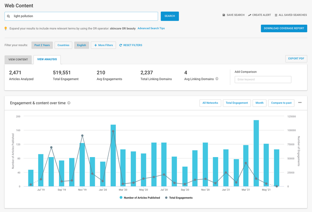
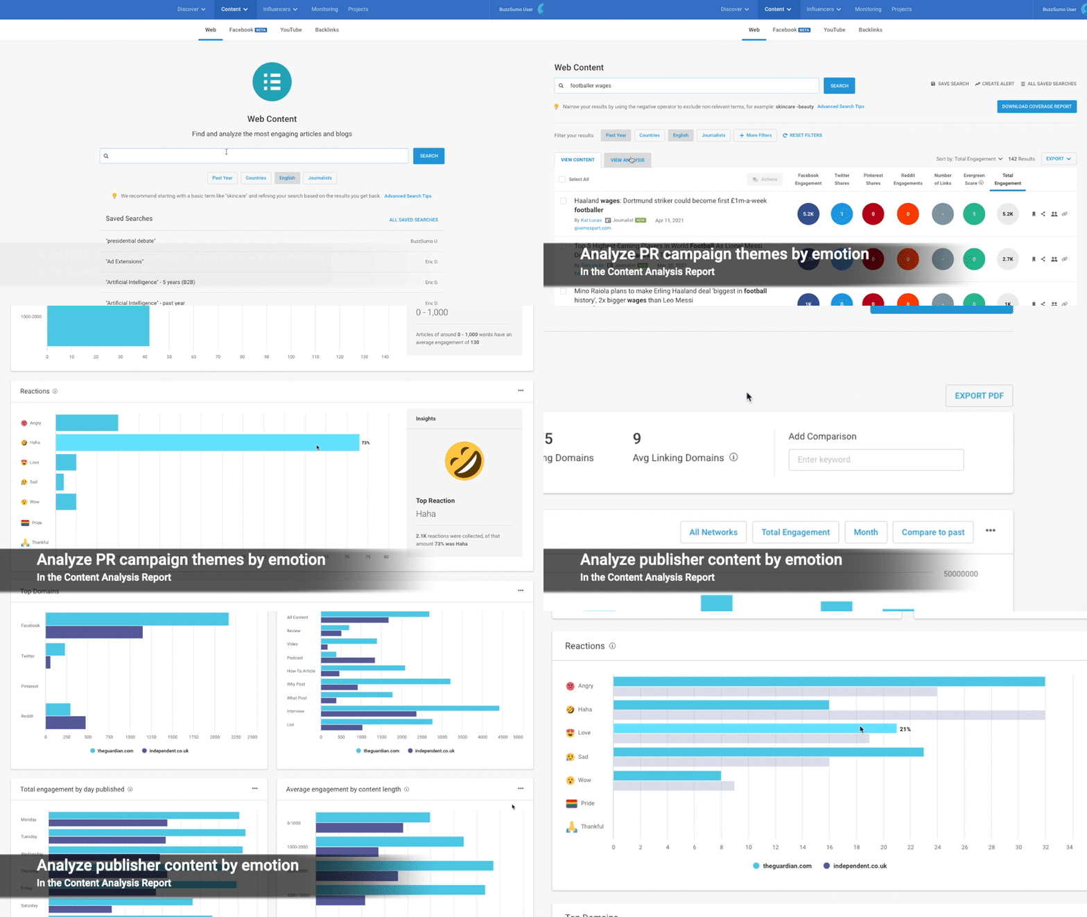
Instead, start off by researching key terms in BuzzSumo’s Content Analysis Report tool.
So, if your client or brand sells honeymoon packages as an example, start with your product area “Honeymoons” and then branch outside of your core offering to “Engagement rings”.
Do this until you get too far removed from your offering.
Take all of this analysis, and identify any seasonal trends, e.g. Halloween campaign ideas or current trends.
PR Campaign Example #1: A world without light pollution
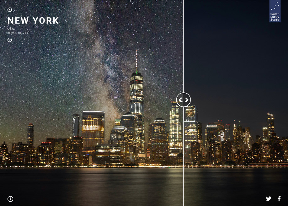
We did a campaign on what the most light polluted cities in the world would look like without light pollution.
The research for that campaign went as follows:
Product theme: Star maps (Not enough there for a campaign)
Secondary theme 1: Supermoons (Lots of social engagement, occur regularly enough for reactive PR)
Secondary theme 2: Night sky (Lots of social engagement)
Secondary theme 3: Light pollution (Lots of social engagement, current topic, more scope for ideas)
Light pollution as a theme was consistently talked about, but at the time before the launch, it was booming.
SpaceX had launched satellites into the atmosphere that would cause more light pollution, and because of Covid, pollution in general was a hot topic.
We knew now was the time to launch the campaign.
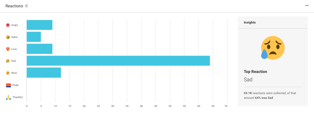
We also knew that, judging by the reactions on articles to do with light pollution, it either made people sad or had a bit of a wow factor – so we had the emotions for our outreach angles nailed down early on.
We knew it had to be visual to meet the wow factor, and it had to make people think about a world without light pollution.
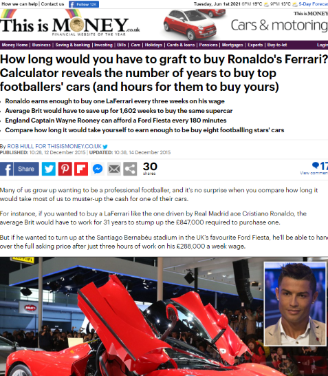
PR Campaign Example #2: Footballer car cost calculator
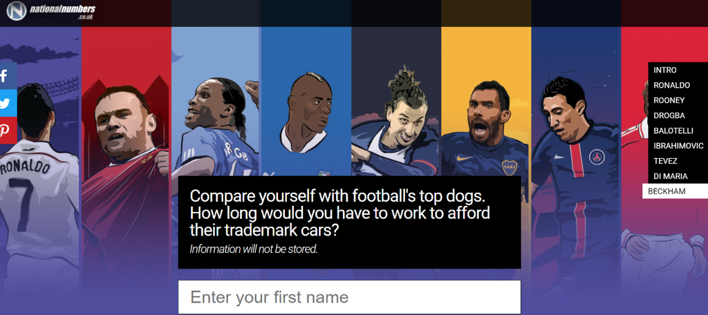
I ran a campaign around six years ago that showed how long you’d have to work to afford a footballers car vs how long they would have to work to afford your car.
As you can imagine, when we’re talking about emotions we weren’t really focusing on the positive ones with this campaign, but it picked up a ton of links at the time and I’ve never properly deconstructed it until now. The research went as follows:
Product theme: Private number plates (Some funny number plate content but enough there for a campaign)
Then I started branching out into aspirational lifestyle themes.
Secondary theme 1: Celebrity cars (Lots of articles produced)
Secondary theme 2: Footballers cars (Lots of content + lot of reactions in the comments)
When I analyzed the comments of these articles, I realized why they were so popular with the publishers.
They drove people mad.
There was also an element of competitiveness and one-upmanship going on.
I realized people read these articles and automatically compared themselves, so why not make that comparison literal with a calculator?
I genuinely think if you can come through this phase with an idea that’s linked to successful themes and that taps into 1-2 emotions, you are already on your way to running a winning campaign.
It’s a step I go through before every single campaign I run.
2. Decide on the absolute best format and add depth to it
A good idea doesn't mean it’s a good idea across every format. I wouldn't have created the light pollution PR campaign example as a blog post, as it would have completely defeated the wow factor we were going for.
Just showing the re-designed skylines by themselves may have worked still, but the “before” and “after” comparison using a simple piece of slider code added a bit of interactivity to the piece.
The format is vital, as are the amount of depth and angles the idea has.
Quite a lot of the time, one main angle might be all you need. In the light pollution campaign we knew that 85% of Americans had never seen the Milky Way.
That was a strong angle, but from there we added stats from the Bortle scale to show the most light polluted cities (10 on the Bortle scale), in comparison with what they would look like as a 1 on the Bortle scale.
Again, we could have limited this to the USA, which was our main focus, but it made sense to make this piece global – after all light pollution is a global issue.
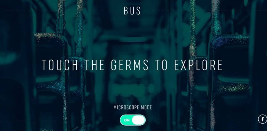
PR Campaign Example #3: Touch the germs (Microscope mode)
When thinking about depth and format I think of this campaign for Stavely Head.
This could have easily been a simple graphic or a data list, but the team went a lot further and built on the format to show a microscope function, which made the campaign special.
This campaign had depth and hit the right format, which meant it made a splash in terms of high volumes of links.
But it also gained another form of media coverage: the mayor of London himself commented on the issue. In this case, the format justified the scale of the idea
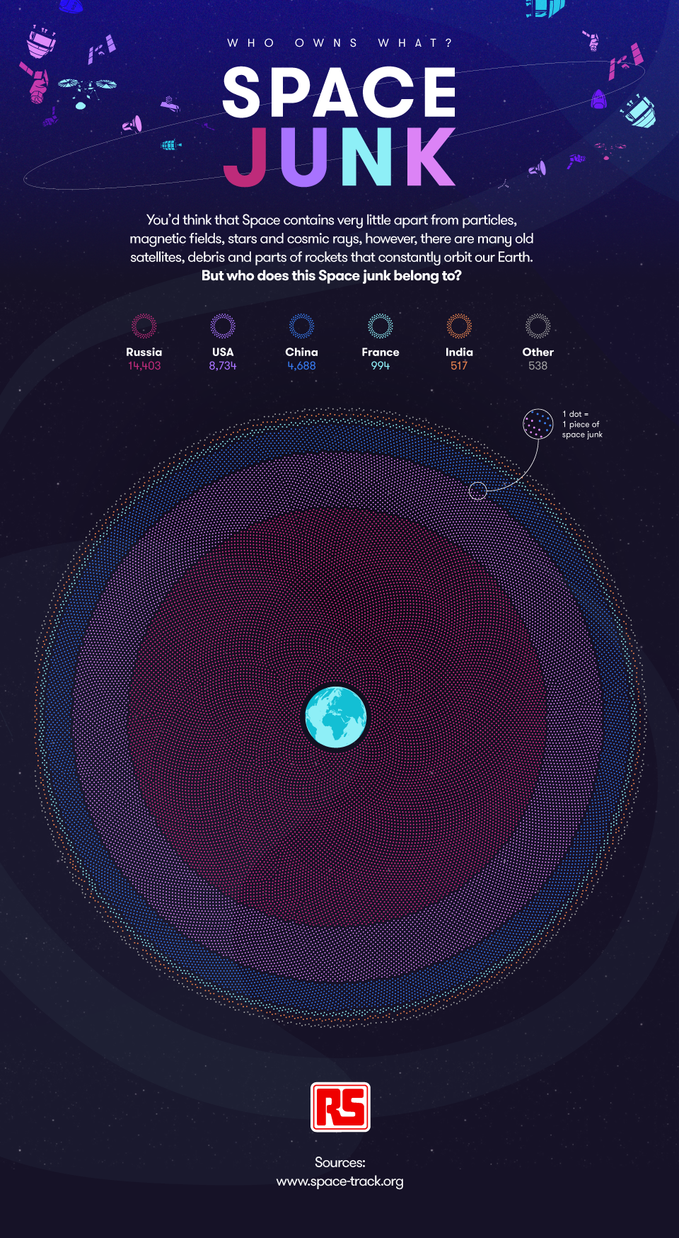
PR Campaign Example #4: Who owns all the space junk?
Sometimes you can be held back by a site's limitations – which I’m going to assume was the case with this piece on space junk from Aira.
Don’t get me wrong, I really like this piece and I like how it’s visualized, but no doubt there could have been more made with an idea this vast.
There’s all kinds of development work you could add to a concept on space junk broken down by country.
It still has its main angle on who owns all the space junk – but what kind of space junk? What does space junk look like now vs the 60s? What will it look like in 100 years?
There’s so much more that could have been added to this, considering the theme was spot on.
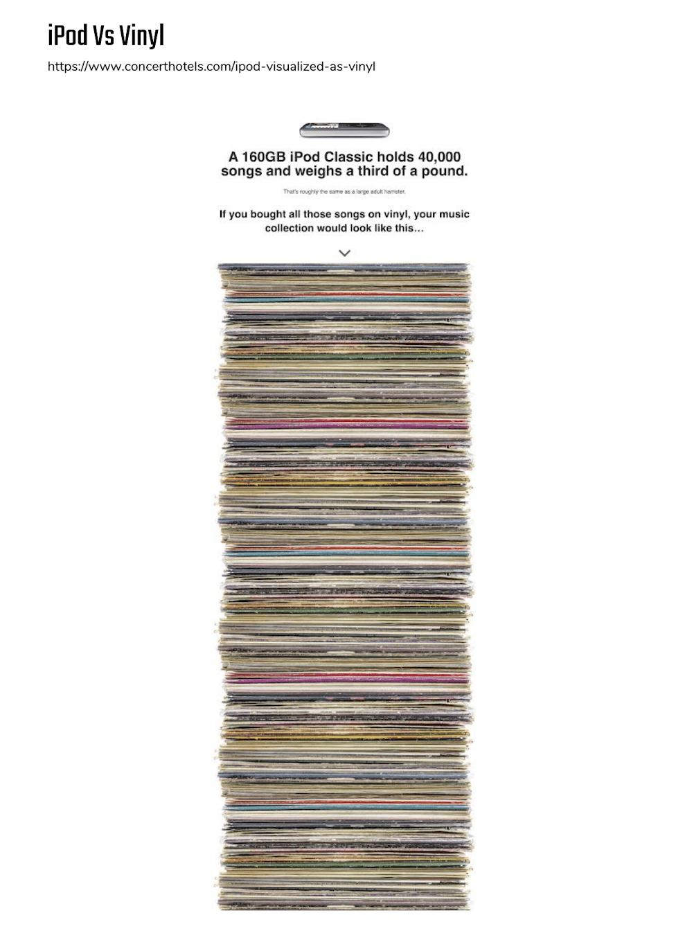
PR Campaign Example #5: iPods visualized as vinyl
The best formats don't always have to be complex either. I love the simplicity of this PR campaign idea from Mark Johnstone (Formerly of Distilled).
It simply shows what your iPod classic would look like as a vinyl collection. No need for unnecessary development here. It's the simplicity that makes it, and all the page has added to it is almost a humorous scroll function.
I mentioned earlier on in this piece that comments on articles published about footballers' cars led me to create a literal comparison in the form of a calculator.
That piece also had numerous angles we could go out with that used simple data from weekly wages vs the cost of cars. Angles included
- Ronaldo earns enough to buy one LaFerrari every three weeks on his wage
- Average Brit would have to save up for 1,602 weeks to buy the same supercar
- England Captain Wayne Rooney can afford a Ford Fiesta every 180 minutes
With the correct format and enough depth and angles, any campaign has a chance of succeeding.
Marry these up with the first step of building campaigns around successful themes and emotions, then your campaigns will be a big hit across Digital PR and social.
Other PR campaign idea tips
Re-use your initial research for seeding lists, to increase relevance
This one’s simple.
Go back to your research on themes and export the most relevant articles, so you have a ready made list of journalists and sites that have talked about your campaign subject in the past.
This is really easy to do in BuzzSumo. Just save journalists to a project, and export their details.
BuzzSumo has conducted a great study of 600K journalists to show you how to create a PR pitch and how to get a journalist to cover your story. Check it out when you come to pitch your idea.
Fractl's blog 4 Agency PR Tactics That I Avoid At All Costs also has a great set of questions to ask yourself during outreach, to help you keep your pitch relevant, and their article on driving traffic through PR links gives some other great PR campaign idea inspiration.
Use all of this to get sign off on your ideas
Ideas are subjective right? You have one, your client has one, your boss has one.
What if you took the subjectivity out of the equation?
You can do that by showing your depth of research into themes and emotions, to get sign-off on the ideas you are most confident in.
Package all of stage one up for your idea pitch.
You can quickly report on the engagement and emotion of multiple themes or sites in BuzzSumo's Content Analysis Report.
Key takeaways:
- Explore engagement and consistency of production around multiple themes to help form PR campaign ideas
- Tap into at least one emotion with your ideas
- Match your ideas to the best possible format for that idea –this will vary from idea to idea
- Compare dream with reality to generate an emotional response (ie. footballer wages vs. normal wages, light pollution vs. a mesmerizing view of the galaxy)
- Add as much depth as possible to your ideas. This will result in multiple angles you can outreach with.
If you want to try BuzzSumo's Content Analysis Report to validate your own PR campaign ideas, get a free 30-day trial here.
Categories
Digital PRCategories
Digital PRThe Monthly Buzz⚡
Subscribe to BuzzSumo's monthly newsletter to:
Stay up-to-date with the best of the best in content marketing 📝
Get data-informed content, tips and tidbits insights first 👩🏻💻
Read top shared content by top marketing geeks 🤓
Try
Enter any topic, term or url to search to see BuzzSumo in action. It’s free!
100% free. No credit card required.


