Published March 20th 2023
The Definitive Guide To PR Reporting in 2023
Although the need and rationale for PR reporting appears self-evident, it is generally seen as a necessary evil by most PR professionals.
PR people everywhere are ultimately accountable to various groups of stakeholders and have to inform them about what they planned to do – and whether they achieved it or not (within a given timeframe and budget).
When it comes to PR reporting, the reality is that it’s still often seen as a weekly or monthly scramble to pull together disparate sources of data, wrangled into a Word, PowerPoint or PDF document, with some textual commentary which gets emailed to clients (internal or external) with seconds to spare.
And then the process rinses and repeats every week, month or quarter.
It doesn’t have to be this way!
In this definitive guide, we look at the who, what, why, when and how of PR reporting in 2023.
The arrival of ChatGPT in November 2022 also means access to a far broader array of data analysis and PR reporting capabilities than ever.
Ultimately, the goal is to spend less time producing PR reports and dashboards, and turn them into value-added business drivers, rather than bottomless repositories of meaningless data puking.
Let’s find out how...
Contents
Who are PR reports intended for? (and what do they want to know?)
When and how should you report? (the importance of reporting cadence)
How do you approach the creation of a PR report?
What kind of PR report should you be creating in 2023?
An example of an actionable PR report (Using BuzzSumo and Google Looker)
Creating an integrated PR reporting dashboard
How to use ChatGPT as a PR reporting assistant
Machine learning for the (PR) masses
Why do PR reports exist?
PR reporting is typically seen as a “rear view mirror” exercise. Someone, somewhere (usually a HIPPO – Highest Paid Person’s Opinion) wants to know what the PR team have been doing – and whether things are “on track” and delivering a positive return on investment (this of course presupposes that there is already a plan in place with defined targets and KPIs that allows the PR team to be able to determine how well they are doing).
Arguably, PR reports are usually just about what has already happened.
However, they should also provide indications as to what to do next, as a result of what has already occurred.
A key question to ask of any PR report is:
“Will we do anything differently as a result of what the PR report tells us?”
Far too often, the PR report gets sent to people who, even if they read it, don’t ask questions about what the data and metrics are revealing. Or how it might inform changes in approach.
According to Cole Nussbaumer Knaflic, in her book Storytelling with Data:
“There is a story in your data. But your tools don’t know what that story is. That’s where it takes you—the analyst or communicator of the information—to bring that story visually and contextually to life. You must shift from simply showing data to storytelling with data. Being able to tell stories with data is a skill that’s becoming ever more important in our world of increasing data and desire for data-driven decision making.”
Ironically, PR professionals are supposed to be expert storytellers – which indeed they are when it comes to creating narratives and messaging around PR content for clients.
However, data storytelling has become an equally important skill – especially around PR reporting.
Reporting on the performance of your PR efforts is essential, and can be done by identifying and tracking key metrics, such as coverage generated. By setting up a BuzzSumo Alert surrounding your brand and keywords relevant to your campaign, you can monitor its impact.
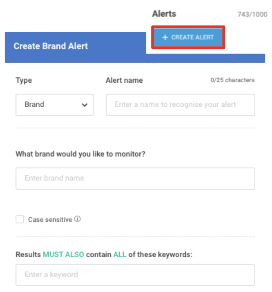
Using the Coverage Report in the Monitoring section of BuzzSumo can help you track the total mentions around your brand and keywords, report on mention placement (ie. headline, first paragraph, second paragraph etc.), and analyze article and publication engagement.
Who are PR reports intended for? (And what do they want to know?)
All metrics are political, including PR metrics. The things you choose (or are told) to report on reflect what things are considered to be important, meaningful, impactful, etc. for your organisation (or at least senior management).
Some of the most important questions to ask about any PR report are:
- Who wants this PR report?
- Why do they want it?
- What is the PR report intended to reveal to them?
- What do you want the recipient to take from it?
Getting clear answers to these questions will help greatly in determining exactly:
- What kind of report or PR dashboard you build
- How you deliver it
- How often you have to update it
- And the time, money and effort needed to create your reports for all relevant stakeholders
When and how should you report? (the importance of reporting cadence)
The decision on how frequently reports should be created and distributed is often overlooked.
Weekly and monthly report cadences are simply used because people expect a report with a regular frequency, and are therefore the most common report timeframes.
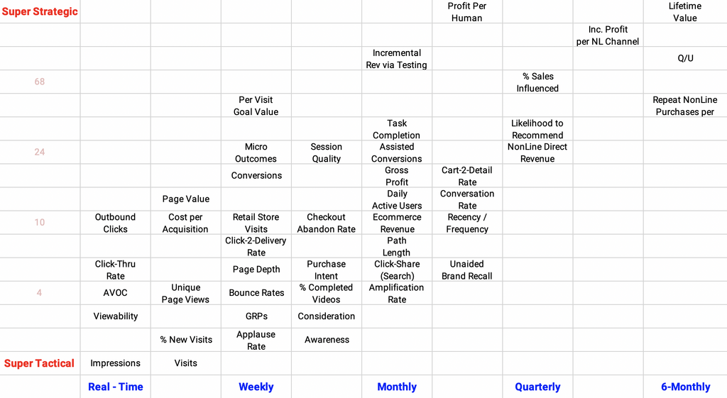
Web analytics guru Avinash Kaushik wrote a blog post in July 2018 which outlined an impact matrix framework for digital analytics.
In simple terms, he argued that reporting frequency should be determined along two scales:
- Are the report metrics super tactical or super strategic?
- And what is the role of the intended report recipient?
The chart below maps out report frequency in relation to who will be interested in specific numbers along the tactical/strategic scale.
Some of those metrics may already apply in PR reports. Those that aren’t can easily be incorporated into the matrix.
Using this framework can help shape decisions around what data to collect and report on – and how frequently to share it with relevant stakeholders.
In a similar way, it is important to not let the ability to create faster reports or near real-time dashboards drive reporting frequency, at the expense of the metric being measured.
Determining Return on Investment (ROI) is a case in point.
LinkedIn recently released the results of a survey of over 5000 marketing professionals which revealed that:
“77% of marketers are measuring ROI within the first month of their campaign, knowingly trying to 'prove ROI in a shorter amount of time than their typical sales cycle', while only 4% of marketers even measure ROI over a six-month period or longer.”
PR professionals are always being asked to prove ROI.
However, this metric needs to be reported on over a much longer time period, and shouldn’t be part of a weekly or even monthly reporting dashboard.
How do you approach the creation of a PR report?
Before you explore different types of PR reports, ask yourself...
- What have we actually done?
- How much time have we spent and on what activity?
- How much money have we spent?
- What have we achieved?
- Are we on track to meet our overall goals?
Very often the really important metrics are comparisons…
- How do our results compare month on month, quarter on quarter, year on year?
- Are we where we expected to be? If not, why not?
- What can the data tell us to allow us to make informed decisions about what we need to do to get back on track?
These are all fundamental questions that PR reports everywhere are ultimately trying to answer.
What a PR report should and should not be
In terms of format, the PR report is still often delivered as a Word or PDF document or PowerPoint deck.
Or it might even just be a simple weekly text-based email. There is one thing all of these report formats share.
They are static.
The data in them is “fixed”.
And the only way for the recipient to interrogate the data further is to go back to the report creator and ask questions.
In addition, they can often lead to the phenomenon described by web analytics guru Avinash Kaushik as “data puking”.
Rather than make strategic decisions about what data is relevant (or what data narrative the report author is attempting to convey), everything gets thrown in – and the burden of interpretation is placed upon the shoulders of the recipient.
PR report dos and don'ts:
❌ DON'T create static reports that can't easily be updated
❌ DON'T include lots of arbitrary metrics which overwhelm the receiver of the report
❌ DON'T make the receiver of the report spend a long time interpreting
✅ DO create real-time, auto-updating PR reports, or static reports that can be easily updated
✅ DO be selective with the metrics you include, to tell the story you need to tell
✅ DO make it easy for the receiver to follow, and know where to focus their attention
What kind of PR report should you be creating in 2023?
In recent times, PR dashboards have become all the rage. In principle, the benefits should be obvious.
PR dashboards should provide an excellent way to convey relevant PR reporting in a timely manner to relevant stakeholders.
They are typically web based, accessible 24/7 and often allow the end user the ability to analyze the PR report data for themselves.
Given these benefits, why haven’t PR reporting dashboards gained mainstream acceptance?
To date, the barriers have mainly been around cost and the effort needed to set up and maintain these dashboards.
With the emergence of free dashboard creation and display technologies such as Google Looker, many of these issues no longer apply.
More specifically, tools like Google Looker give PR report creators the power to combine different data sets in ways that would have been unimaginable in the past.
But they also open up the ability to create more customized PR reporting dashboard formats that more fully meet the needs of PR report recipients in 2023.
An example of an actionable PR report (Using BuzzSumo and Google Looker)
Where do you get the data from, in the first place, that you need to fuel your PR reports?
Fortunately, BuzzSumo can help with many of the key elements of a modern-day PR report dashboard.
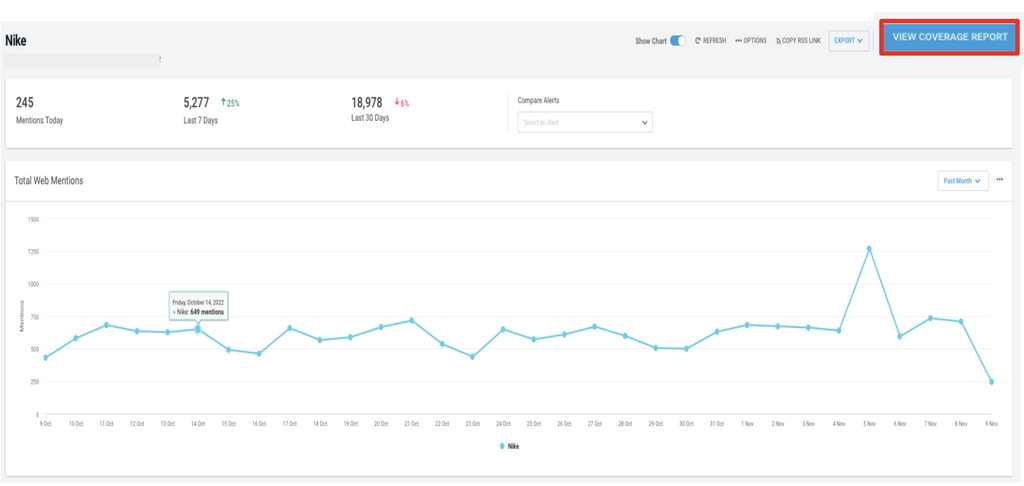
BuzzSumo’s monitoring tool can be used to capture media coverage URLs, as well as other useful data points, such as domain authority and social media amplification.
It provides a really useful real-time report that allows users to track volume of coverage content over time.
See how the BuzzSumo team uses its own tool for different types of publicity, to generate a 108% uplift in free trial signups.
BuzzSumo's Media Coverage Monitoring
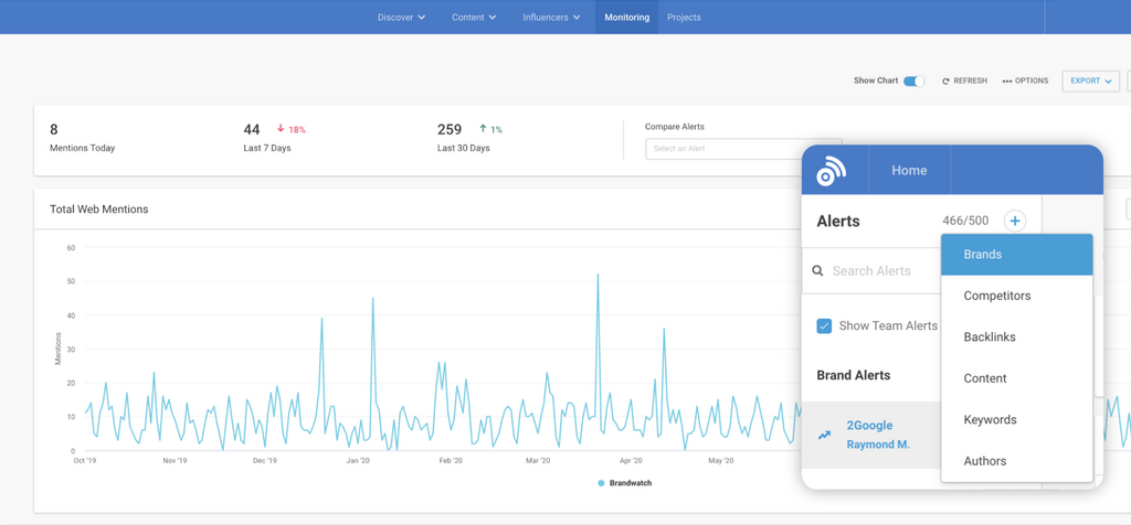
BuzzSumo Alerts Contain A Lot Of Information

For the purpose of more general PR reporting, you might want to be able to display this data in a different format, or combine it with other PR reporting data to provide a more holistic view.
BuzzSumo makes it very easy to get data out by providing three very powerful ways of exporting information for use in other tools.
In the case of monitoring data, you can use an RSS feed, export a CSV spreadsheet file, or use BuzzSumo's API.

This Google Sheet can then be used to automatically power a Google Looker dashboard – a good example of how to reduce time and effort spent capturing PR reporting data.
Once the monitoring data is in Google Looker, you can extract further value from the data originally captured for you by BuzzSumo.
The following screenshot is an example of a media coverage evaluation dashboard:
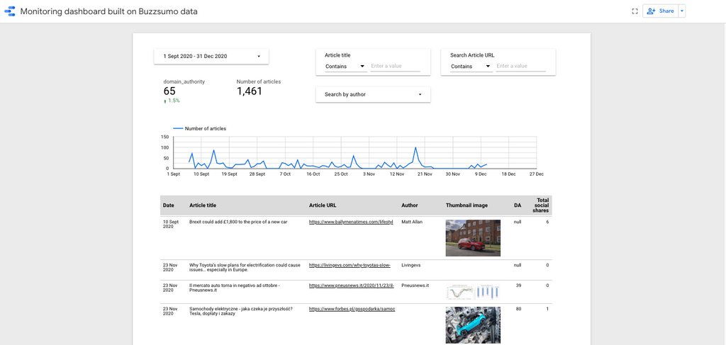
This dashboard allows the user to view:
- Volume of coverage over time
- Changes in overall domain authority of coverage over a given time period
- Changes in domain authority by journalist or publication
Domain authority is a good reflection of the quality and influence of a media outlet.
Being able to demonstrate an overall rise in media coverage domain authority over time would, hopefully, correlate with improved brand awareness and/or business outcomes.
Creating an integrated PR reporting dashboard
By combining data from BuzzSumo, Coveragebook, and other sources, it becomes possible to create an integrated media coverage reporting dashboards.
Google Looker allows multiple data sources to be “blended” together so that the data can be combined to provide a more holistic view (or detect correlations).
In this case, all key media coverage metrics can be contained in a single table.
PR metrics to include in an integrated dashboard:
- Domain authority
- Social sharing
- Monthly visitors
- Estimated article views
- Sentiment
Being able to...
- Track changes in these numbers over time
- Benchmark against an overall goal or target number
... in a single dashboard view, is typically what most PR report recipients are seeking.
But the arrival of OpenAI’s ChatGPT tool in November 2022 changes everything for PR reporting.
Although the PR industry has, to date, focused on ChatGPT’s ability to generate text-based content at the click of a button, it could be argued that it has far bigger implications for many aspects of PR reporting.
And Google has brought machine learning to the PR masses via a free Google Sheets add-on.
How to use ChatGPT as a PR reporting assistant
In the past, one of the barriers to PR professionals getting more insight from data was a lack of statistical analysis or spreadsheet skills.
Most PR people don’t have the time or inclination to learn how to use obscure functions or write Excel macros.
But ChatGPT has turned out to be a useful, on-demand analytics assistant.
Ask ChatGPT to provide the necessary spreadsheet function to generate a certain output, and it will.
With an explanation.
Not only that, Google Sheets users can now also access GPT features directly within the spreadsheet via free add-on functions (strictly speaking, there's a cost for any generated output via GPT, but its minimal. Pennies not pounds).
This allows for the automatic analysis of data already captured.
For example:
You can run a sentiment analysis on headlines and content already contained within your spreadsheet
The screenshots below shows how easy it is to now run sentiment analysis on existing media coverage data sets, for pennies.


It also opens up the possibility (in relation to sentiment analysis) of a far broader palette of sentiment terms.
Why stop at just using positive, neutral, negative as terms for evaluation?
Ask GPT to provide a 2, 3, or 20 word sentiment analysis.
Simply change the prompt and update the spreadsheet.
Your revised output will be created in seconds.
Because GPT is accessed as a spreadsheet function, it can be combined with other functions to deliver calculations and insights which would have been unimaginable only months ago.
The point here is that powerful AI technology, once only available to organizations with large resources, is now accessible to anyone with a computer, a browser, and an internet connection.
PR measurement and reporting is an area of public relations practice that stands to benefit hugely from this.
Machine learning for the (PR) masses
Another AI tool launched in December 2022, but has so far received little or no attention at all compared to ChatGPT.
And that tool is Google’s Simple Machine Learning (ML) Add-On for Google Sheets.
In many ways, this kind of technology could be just as impactful for many aspects of public relations as generative AI.
In plain terms, the Simple ML Add-On brings machine learning-based data analysis to the PR masses.
Much has been made of the power of Big Data over the last decade, and the ability of machine learning-based AI technology to detect patterns and insights in huge data sets.
However, the cost and computing resources required to support it has meant that only a relatively small group of large organizations have been able to benefit from it.
It has generally been out of reach for most PR professionals.
Until now...
Today, anyone with data in a Google Sheet can use machine learning on their own data sets.
There are a lot of obvious use cases in the realm of public relations.
2 ways to use Google's machine learning sheets add-on for PR:
- Analyze trends and patterns in media coverage headlines or social media content
- “Fill in the blanks” in data sets, providing levels of statistical confidence in the suggested numbers
Google has already introduced this technology into tools such as Google Analytics.
They have estimated data for website visitors who rejected cookie consent, by analyzing and extrapolating from those who do agree to share data.
By “modelling” the numbers that do exist, the Google Sheets Add-On can provide an often accurate method of plugging holes in data beyond simply guessing.
And with this type of analysis, you could estimate media coverage exposure (stats) where none previously existed.
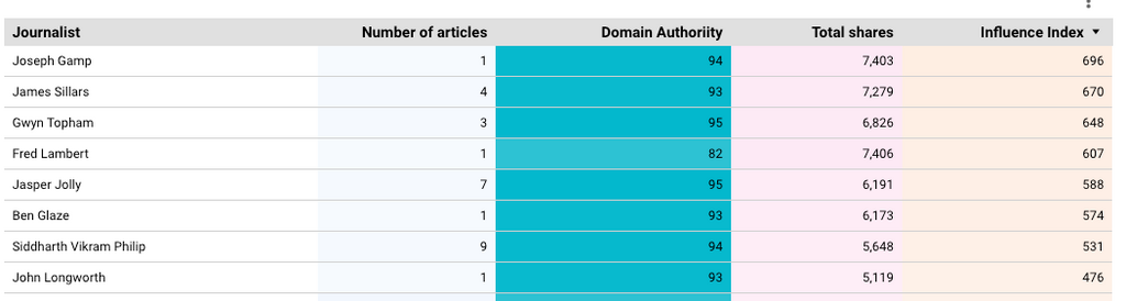
Create your own media coverage metrics
Adding your chosen data into your integrated dashboard (ie. via Google Looker) opens up the opportunity for you to create your own calculated metrics.
For example, by taking into account both the:
- Overall Domain Authority score for a journalist’s media articles, and the...
- Amount of social engagement that an individual journalist’s article gets
You can automatically calculate an Influence Index score.
The screenshot below shows how this might work in practice.
Even though a journalist might have written more stories than another journalist, the latter may have more “impact” because the title he/she writes for has a higher domain authority and the wider social amplification would have had broader reach.
This could have relevance for determining which journalist may have greater future impact and would influence media targeting by the PR team.
Pro Tip
Ask ChatGPT for metric ideas
Why not ask ChatGPT for ideas and inspiration about new metrics to create based on your data sets?
What makes for an ideal PR reporting dashboard?
As ever, Cole Nussbaumer Knaflic has some great advice about building dashboards – and they particularly apply to PR reporting dashboards:
“Picture a blank page or a blank screen: every single element you add to that page or screen takes up cognitive load on the part of your audience—in other words, takes them brain power to process. Therefore, we want to take a discerning look at the visual elements that we allow into our communications. In general, identify anything that isn’t adding informative value—or isn’t adding enough informative value to make up for its presence—and remove those things.”
The six golden rules of dashboard design are:
- Understand the context
- Choose an appropriate visual display
- Eliminate clutter
- Focus attention where you want it
- Think like a designer
- Tell a story
Pro Tip
Ask ChatGPT for data visualization ideas
Again, why not use ChatGPT for guidance on best chart formats for displaying certain data types, or the best way to express a particular data narrative?
What about combining media monitoring data captured by BuzzSumo and blending it with, say, branded search volume data?
In doing so, you could show how improved media visibility is resulting in higher brand awareness which, in turn, is generating higher sales, revenue, and profitability?
Or why not show how increased social sharing and social media impressions are also impacting brand awareness?
There are many other PR reporting use cases to which these tools and techniques can be applied.
PR reporting in 2023 should move from a resource and time-consuming evil, to a value-added business driver that allows PR professionals to spend more time gaining valuable insights into impact and delivering more effective PR work.
In summary, the PR professional of 2023 has access to an incredible amount of analytical firepower at minimal cost. Fill your boots.
Hopefully this guide (in conjunction with BuzzSumo, Google Looker, and all other tools mentioned) will help you to kickstart your newly optimized approach to PR reporting.
Planning your next PR move?
Read BuzzSumo's related guides:
- The Ultimate Guide To Trendjacking
- Newsjacking Dos and Don’ts From a BBC Journalist Turned PR
- 4 Agency PR Tactics That I Avoid At All Costs
- How To Write And Distribute Press Releases
Or check out BuzzSumo's latest report, where they studied 600K journalist profiles to analyze how to pitch journalists.
About the author
Andrew Bruce Smith of Escherman is a specialist digital PR, social media, SEO and analytics trainer and consultant.
With a career spanning 36 years, he was cited in 2018 by the UK Chartered Institute of Public Relations (CIPR) as “one of PR’s greatest thinkers”.
Andrew has been a consistent digital innovator, being among the first UK communications practitioners to exploit e-mail (1990), the World Wide Web (1994) and Twitter (2007).
He has consulted or provided training to over 2000 organisations in the last 10 years including NATO, the Department of Environment (DEFRA), NHS, Specsavers, Sky, Jaguar Land Rover, Disney and many others.
Categories
Digital PRCategories
Digital PRThe Monthly Buzz⚡
Subscribe to BuzzSumo's monthly newsletter to:
Stay up-to-date with the best of the best in content marketing 📝
Get data-informed content, tips and tidbits insights first 👩🏻💻
Read top shared content by top marketing geeks 🤓
Try
Enter any topic, term or url to search to see BuzzSumo in action. It’s free!
100% free. No credit card required.